Thursday, 17 December 2009

Monday, 7 December 2009
Ideas for Coursework.
For our coursework, me and Reece came up with the idea of doing a mystery opening.
We had the idea of making everything saturated apart from red being blood.
We also thought that we would put some shots in reverse so that the audience could tell it was the past. The modern day shots would be in normal time and also be in full colour - this would show the audience which shots were at which time. We would also interchange them so we wouldn't tell the whole story at once, this will be parallel editing.
We were thinking of having blood dripping and a killer leaving the murder scene, meanwhile, in colour a detective comes and and walks into a murder scene, maybe meeting policemen along the way much like the film memento. We could then incorparate the Snatch idea into this for the credits.
I think that this would be effective but some shots would be hard to shoot and if not edited correctly then it would look bad.
We had the idea of making everything saturated apart from red being blood.
We also thought that we would put some shots in reverse so that the audience could tell it was the past. The modern day shots would be in normal time and also be in full colour - this would show the audience which shots were at which time. We would also interchange them so we wouldn't tell the whole story at once, this will be parallel editing.
We were thinking of having blood dripping and a killer leaving the murder scene, meanwhile, in colour a detective comes and and walks into a murder scene, maybe meeting policemen along the way much like the film memento. We could then incorparate the Snatch idea into this for the credits.
I think that this would be effective but some shots would be hard to shoot and if not edited correctly then it would look bad.
Sunday, 6 December 2009
Notetaking.
I have learnt that I need to focus more on the comparison between shots and the deeper meaning behind things instead of just the obvious. I also need to focus on the setting and background and what it says about the characters.
Wednesday, 2 December 2009
Music
Music
View more presentations from Alexfarnell.
This is the embedded video of All American Rejects - Mona Lisa (When the World Comes Down). I like this song because it makes me feel relaxed, i like the lyrics because they're saying to think about the simple things that make you happy and how you don't need posessions. All you really need is your friends. It makes me feel optimistic. It's from their 3rd album which personally is my favourite because it's not as upbeat as their previous 2, I like this album because it's very relaxed.
Here's another pity
And there's another chance
Try to learn a lesson
But you can't.
If we can burn a city
In futures and in past,
Without a change our lives will never last.
Cause we're going fast.
You can sit beside me when the world comes down,
If it doesn't matter then just turn around.
We don't need our bags and we can just leave town.
You can sit beside me when the world comes down.
What can we do better,
When will we know how?
A man says from a sidewalk to a crowd.
If we can change the weather,
If you wanted to yourself.
And if you can't I guess we all need help, yeah,
I need help.
You can sit beside me when the world comes down,
If it doesn't matter then just turn around.
We don't need our bags and we can just leave town.
You can sit beside me when the world comes down.
We say
And we do
All the lies
The truth
And all I need is next to me.
Yeah, we're going fast.
You can sit beside me when the world comes down,
If it doesn't matter then just turn around.
Will you be the queen? And I'll be your clown
You can sit beside me when the world comes down.
You can sit beside me when the world comes
You can sit beside me when the world comes down
Comebacks aren't your thing by Steer Clear is another one of my favourite songs.
I like this song because i like the Piano at the beginning, i also think that the tune is quite catchy, it also has a good message within the lyrics.
and lastly Friendly Fires - Jump In the Pool
I LOVE LOVE LOVE this song because i can listen to it on repeat and not get bored :). i like the uniqueness of this song and the instruments used, i also like the MGMT/Empire of the Sun feel to it, although this style gets on my brain like a woodpecker after a long time.
Monday, 30 November 2009
Research for Coursework
This is an example of light graffiti in which a source of light is used to create light on a long exposure picture. The way this video was put together is using stop motion to make it seem like a full moving image. This idea could be effective if used in a film opening although it wouldn't fit in with the whole film. It would also take a large amount of shots to get correct but personally i like this style.
Wednesday, 25 November 2009
Research for Coursework
This is the music video for Calvin Harris - Ready for the Weekend. I like this video because i like the way the camera moves through different objects to different scenarios. This video links with Snatch with the idea of going through objects. I think that this would be an effective title sequence if filmed correctly.
Research for Coursework
This is a link to Innerpartysystem - Don't Stop. I like this music video because i like the shots used, the quick editing and the fast pace. I think the quick editing could be used in the opening to a film, quick shots of inanimate objects and flashes could create a good horror/action/thriller opening.
This is the opening to Watchmen. I like the opening to this because everything is still and 3D like action figures but the camera flashes are very slow and different elements in the shot are moving e.g. a skirt. I think this is an effective opening, although i feel it would be too difficult to imitate.
This is an example of Stop Motion. I like this idea because i like the way you can do anything with it. I think that this could be used in a film opening but i'm not sure which genre it would fit. I don't think it would suit Horror or Action because it's too upbeat for those genres.
This is the opening to Watchmen. I like the opening to this because everything is still and 3D like action figures but the camera flashes are very slow and different elements in the shot are moving e.g. a skirt. I think this is an effective opening, although i feel it would be too difficult to imitate.
This is an example of Stop Motion. I like this idea because i like the way you can do anything with it. I think that this could be used in a film opening but i'm not sure which genre it would fit. I don't think it would suit Horror or Action because it's too upbeat for those genres.
Monday, 23 November 2009
Research for Coursework
This is the video to Kids in Glass Houses song Give Me What I Want, this video reminds me of the opening to snatch because of the way the camera goes through the wall into the next shot. I think this idea could be an easy way to link the characters together but it would be a hard thing to film due to the wall being cut away effect.
These are two videos by Hadouken!. I like these beginnings because they don't give anything away for the rest of the video. Turn The Lights Out is good becuase i like the colours and the quick changes to different objects. I also like the colours in Wait For You because they're very neutral and plain.
Wednesday, 18 November 2009
Research for Coursework
This is the music video for Billy Talents song Surrender from their album Billy Talent II. I really like this video because of it's simplicity in it's setting, i think this would work well in a film opening because complexity will be hard to find and i like the range of shots. I like the way that everything is out of focus unless it's right in front of the camera which Ben Kowalewicz seems to be throughout most of the video. I also like the shots of seemingly innocent objects at the beginning of the video in tact and then breaking and smashing during the song. I also this it's effective the way that holes appear in the walls and let light into the room, it also seems like the room is falling down around the band.
This is Saving Aimee - We're The Good Guys music video. I like the initial layout of this video and the way it zooms in and out of different sections of the giant picture. I like the use of block colours and a white background because i think this makes everything stand out more. I also like the game of PONG played by two of the band members, i think this makes the video look more interesting, i like the way they have incorporated themselves into the game. I also like the idea of putting each different band member in a section of the screen at the same time, i think this idea could be a good way of making titles and introducing characters in a film opening. I also think the ending of the video where the action is stopped as the band is in mid-air is clever because it's a good way to end, in a film this could be the characters walking into the distance or something.
Research for Coursework
This is the opening credits to Se7en. I like the jumpy shots and the hectic feel of this video because it gives you a feel for the rest. I also like the way the camera focuses on the pages turning and a mans hands with plasters, this makes the audience wonder what's going to happen, i also like the way the writing jumps around with the shots.
This is the opening to the film Snatch, Reece found this and likes the way the camera moves locations smoothly and the way the characters were introduced. I also like this and we will consider this style when making our film. The music video to All Time Low - Weightless is similar the way the writing comes up by the characters, but personally, i prefer the way that the producer of this music video has made the writing continue with the action.
Tuesday, 17 November 2009
Signs.
In class we were told to go around the school and take photos of us next to different signs. These are 3 examples of signs Me and Reece found:


This was an example of an advertisement. It contains icons of the different places logos. The enigma code of this advertisement could be "Why should I demand extra?".
This is an example of a didactic sign, this means that there is no option in it.

This is the example of a charity sign.
We were also asked to find:
- Political
- Religious
- Imperative (saying you must)
- Denotive (e.g. schools 'Dare To' posters)
- Icon
- Index (A picture of the thing made by the thing meaning to show e.g. corrosive on acid)
Monday, 16 November 2009
Research for Coursework
This is the american opening credits to the series House. I like this because i like the simple layout of it and the music is quite effective although i prefer the UK music. i like the colours in it and i think the end shot is effective because it shows the power within the hospital. I also like the shot that shows the setting of the hospital, this clarifies to the audience where the show is set.
Research for Coursework
This is the title sequence to Juno. I like this sequence becuase i think the way Juno walks from colour to animation looks effective, i like the way that the background looks coloured in becuase i think it gives the sequence a youthful feel. I also like the way that at the very end Juno walks into the colour again but the animation is still left on screen slightly.
This is the title sequence to Kiss Kiss Bang Bang, i like how this sequence has different things coming from the gun when it's been shot, much like the title sequence to Casino Royal. In both these sequences only really contains blacks, whites, creams and red. In Kiss Kiss Bang Bang all the people are in sillhouettes where-as in Casino Royal, James Bond is shown in colour. I also like the way that Kiss Kiss Bang Bang moves along with the music in the last 25 seconds or so.
In Casino Royal I like the way that when Bond is fighting other people and he hits them they break into card suits - which fits with the theme of the film. i think the way that the target goes over the card faces and shows a real persons face is effective. I think this title sequence fits in well with the film because all the bullets and wounds are card suits, i also like the way that the targets turn into roulette tables. I think the end is effective when there is money and cards flying around and as the shadow walks towards the camera, Daniel Craigs face comes into light.
Wednesday, 11 November 2009
Representation powerpoint
We were told to create a powerpoint about 1 of the 7 different areas of representation. I was put with Lauren and we were given Ethnicity:
Ethnicity
View more presentations from Alexfarnell.
Commando
We watched the opening to the film Commando starring Arnold Schwarzenegger and pointed out the fatherly traits and the masculine traits shown by him:
Fatherly:
Fatherly:
- Playful
- Spoils daughter
- Covers up when with his daughter
- Teaches daughter defence
- Very sensitive
- Camera shot of him beneath his daughter shows his vulnerability
- Nature loving
- He brings the fish in which shows that he doesn't want his daughter to be the stereotypical female and scream.
Masculine:
- No expression
- Carries a tree
- Knows kung-foo
- Brings fish in
- When he comes in from work the daughter makes dinner
- Chops wood
- Intelligent
- Carries daughter on back to show his strength
- Stares outside
- He pushes the car to start it.
The 39 Steps
In class we discussed the gender, status and class shown by the characters John Hannay played by Rupert Penry-Jones and Victoria Sinclair played by Lydia Leonard during the film The 39 Steps. The film is set in 1914 in the run up to the first world war. We firstly discussed Hannay when we first see him:
John Hannay:
John Hannay:
- Well dressed
- Clean cut
- Dark blue suit
- Well spoken
- Posh/received pronunciation
- Alphamale although not stereotypical
- Camera work suggests he's clumsy
- Not scared/unfazed from being shot at
- Fits the action genre
- Seems hectic from the editing
- Setting suggests he's isolated and an impostor which contrasts to his usual surroundings of london.
- Setting also makes him seem vulnerable from the police and the plane shooting at him which makes him in danger.
We then looked at Victoria Sinclair and Hannay and how they interact with each other and their personalities:
Victoria Sinclair:
- Looks the part (wears petticoats)
- One of the only women in the room
- Suffragette
- Men have no respect for her
- Sarcastic
- Strong-minded
- Stubborn
- Violent (kicks a police officer)
- Uses her femininity
- Masculine traits (climbing walls)
- She is shown using The Male Gaze when she's tucking in her petticoats
John Hannay:
- Flirtatious
- Undermines Sinclair
- Gentlemanly towards her
- Sexist
- Superior
The music played during the film creates suspense, it's non-diegetic and the classical music fits the era and the action genre of the film,
Tuesday, 10 November 2009
Shameless representation
In class we were asked to write about how 4 characters were representated in episode 1 series 1 of Shameless. The 4 characters we were given was:
Fiona and Steve:

Lip:

Ian:

This is my answer:
Shameless
Fiona and Steve:
Lip:
Ian:
This is my answer:
Shameless
Thursday, 5 November 2009
Juno Essay
We were asked to write an essay on how a group of people were represented and if we fit the stereotype. I chose to write about Juno:
Juno Essay
Juno Essay
Royal Tenenbaums Essay
We were asked to write an essay based on 1 of the characters of the film The Royal Tenenbaums opening sequence using Mise en Scene:
The Royal Tenenbaums Essay
The Royal Tenenbaums Essay
Thursday, 29 October 2009
Representation - Gender
In UK TV drama there are mainly 4 different types of men. These are:
The geek:- For example in Eastenders there is Tamwar Masood who is a high achiever and is always studying.

The wise old man:- In Eastenders, this is Patrick Trueman
The geek:- For example in Eastenders there is Tamwar Masood who is a high achiever and is always studying.
The wise old man:- In Eastenders, this is Patrick Trueman

The lad:- this can be Phil Mitchell

The labourer:- This can be seen as Minty.

These are 4 stereotypical types of males. The geeky one is always quiet and does well; the wise old man always gives good advice; the lad is always getting into fights and is a hit with the ladies and the labourer is normally a mechanic. This can be seen as The Male Gaze for it can be on how males view each other and the typical stereotypes they see of themselves. These stereotypes can also back up Leon festingers theory saying on how our views on someone don't change until there's drastic evidence against our views. This also supports Tessa Perkins' idea that stereotypes aren't always negative for the wise old man is a positive stereotype to have. The geek in these TV Drama's are normally Asian; the lad is normally a white middle-aged male and the labourer is normally a slightly overweight white male, these are how different types are people are represented in our culture. This means that the cultural code for these TV Drama's would only be understood in our society.
Tamwar fits the typical stereotype of young Aisan boys. Stereotypically, aisan boys wear glasses; study alot and get good grades - all of these Tamwar is, this is also an example of the cultural code for only people in this culture could see aisan boys like this.
Wednesday, 28 October 2009
Research for Coursework
This is the title sequence to the film "Catch Me If You Can" directed by Stephen Spielburg. I like this title sequence because I like the way the different characters interact and change relating to the names being put up.
The title sequence of Lemony Snickets: A Series Of Unfortunate Events is another title sequence I find effective for I think the way "The Littlest Elf" is completely irrelevant to the film,I also like the way the credits aren't just overlaid on the frames but instead are incorporated in the frames, in the smoke from chimneys for example
Research For Coursework.
For my final piece of coursework I would like to do an opening of a movie. I was thinking about film openings i have seen and the only ones i can really remember clearly are Tim Burton's openings to his films where he follows a certain thing on a journey. E.G. Sweeney Todd he follows a trail of blood; Charlie and the Chocolate Factory where you follow a bar of chocolate in production. Here are some examples:
This clip from The Nightmare Before Christmas also has this style, apart from instead of following around a production line or a single object you are taken around "Halloweentown" until you're introduced to Jack.
During the Corpe Bride you follow a journey of a butterfly throughout the town until you come into contact with the first character:
These are all good examples of The Male Gaze for they are all from the point of view of a male for Tim Burton has made them. Also, if it was from the perspective of a female then some of the events would be different, for example, in "The Nightmare Before Christmas" the main character of Jack might be a woman. The majority of characters in these openings are male, thus emphasizing the idea of The Male Gaze.
I like his openings because I think that they are memorable. I would like to take this idea and maybe include it in my coursework.
This clip from The Nightmare Before Christmas also has this style, apart from instead of following around a production line or a single object you are taken around "Halloweentown" until you're introduced to Jack.
During the Corpe Bride you follow a journey of a butterfly throughout the town until you come into contact with the first character:
These are all good examples of The Male Gaze for they are all from the point of view of a male for Tim Burton has made them. Also, if it was from the perspective of a female then some of the events would be different, for example, in "The Nightmare Before Christmas" the main character of Jack might be a woman. The majority of characters in these openings are male, thus emphasizing the idea of The Male Gaze.
I like his openings because I think that they are memorable. I would like to take this idea and maybe include it in my coursework.
Sunday, 25 October 2009
Calvin Klein.
In class we were discussing Laura Mulvey's theory on The Male Gaze and Marjorie Ferguson and Trevor Millum's idea's on facial expressions while looking at an advert for Calvin Kleins underwear for women:
This is my answer:
Calvin Klein Essay
We were then asked to write an essay of 500 words answering "How does Calvin Klein represent females in the above advert? Are they objectified or sexually empowered?".
This is my answer:
Calvin Klein Essay
Monday, 12 October 2009
Prelim Evaluation
Film
1. Who did you work with and how did you manage the task between you?
For the film I worked with Reece, Liv and Laura. We decided to split into pairs, while me and Reece did the story board of shots, Liv and Laura decided on the dialogue. When we got round to filming Reece wasn't here so I did the majority of the filming while Laura and Liv acted.
2. How did you plan your sequence? What element did you use for your
inspiration?
We planned our sequence using a variety of of different shots so it didn't look boring:
Match on action
Shot reverse shot
Close up
Mid shot
Long shot.
We also made sure that we kept to the limit of using between 12 and 15 shots. We tried to use things we'd learnt in theory while filming, we worked out our film is a serial with a closed narrative, we also had to make sure all the camera angles we used were effective and relevant.
3. What technology did you use to complete the task, and how did you use it?
To complete the task we had to use a video camera and a mac. We used the video camera to get all the different shots we needed to make our film, we then used the mac to edit it on iMovie. I think that this was quite an effective way to edit our film.
4. What factors did you have to take into account when planning, shooting and editing?
We had to take into account the rooms we were using to shoot, the background noise and the time we had to shoot plan and edit. This means we had to be good at time management to make sure we got the task done in time. We also had to think about what the semantic code shows in our film, like mentioning a party could connotate different things for example alcohol which suggests the gossip will be associated with someone drunk. We also had to think about the enigma code is "What happened at the party?". While editing we also made sure that our worked looked continuous so that it was smooth and the cuts weren't noticeable when watching it.
5. How successful was your sequence/magazine cover? Identify what worked well, and with hindsight, what would you improve/do differently?
I think the film was quite successful, I think that the shots we used were well cut together although i think some of them could be cut down by a few frames to make it look smoother. I think that to improve this in the future we would make sure it all runs together smoothly.
6. What have you learnt from completing this task? Looking ahead, how will this learning be significant when completing the rest of your foundation coursework?
I have learnt how to use iMovie from this task, i have also learnt how crucial a few frames are to making a clip work correctly. This will help me think of a way to make my future videos more effective in the rest of my coursework hopefully making me achieve a better grade.
Magazine Cover
1. Who did you work with and how did you manage the task between you?
For the magazine cover I worked on my own because I felt I had plenty of ideas and I wanted to see how I would manage doing an activity on my own without any guidance from a partner/group.
2. How did you plan your sequence? What element did you use for your inspiration?
First of all, I drew out my idea for the cover, I then thought of information i could include that would be related to my magazine for a school, when it came to the colour scheme i took my inspiration from the school colours, i thought these were relevant for it would show the audience that they were associated. I then drew out my contents page making sure i kept the same layout, colours and fonts as my cover.
3. What technology did you use to complete the task and how did you use it?
To complete the task I used a digital camera and a PC with photoshop on. I used the camera to take pictures of my subject, i then uploaded it onto the PC and opened it on photoshop setting the background colours and page sizes correctly for my cover and contents, I then cut and feathered my pictures on photoshop, added text and headings, i changed things around until i liked the layout and then did the same with my contents page.
4. What factors did you have to take into account when planning, shooting and editing?
As when i made my magazine, i had to take into account the amount of time i had. When shooting, i also had to take into account the background and location where i was taking the photo's. I decided to take them against a plain background outside. When editing i had to take into account my memory space on the computer for if I didn't have enough I wouldn't be able to save what I had done so far. I also had to take the facial expressions of my subject into account, using Marjorie Ferguson's ideas on facial expressions for the front of magazines, i decided to use the chocolate box because it was relevant to my magazine.
5. How successful was your sequence/magazine cover? Identify what worked well, and with hindsight, what would you improve/do differently?
I think my magazine cover and contents were very successful because i feel that the theme is fluent and attractive and i think that the layout is effective. To improve it i probably would make some of the information stand out more and maybe use a different colour in the colour scheme.
6. What have you learnt from completing the task? Looking ahead, how will this learning be significant when completing the rest of your foundation coursework?
From this task I have learnt I can manage time quite effectively on my own, also, i have learnt some new skills on photoshop for i had experimented with it before. I have also learnt the importance of a running colour scheme and using the same fonts. I think this will help me when i come to use photoshop again for it will make me think about what i need to be continuous in my project.
Thursday, 8 October 2009
The Male Gaze
Laura Mulvey came up with the term "The Male Gaze" in 1975, the concept of the gaze is how an audience views the people presented. This can be thought of in 3 ways which are:
Invitational is suggestive of mischief or mystery; hint of contact rather than sexual promise.
Super-smiler is aggressive with a "look at me" attitude.
Romantic/sexual is suggesting that the model is possibly or definitely available.
Using these, I feel that the picture I chose for the preliminary magazine task fits the description of the chocolate box because Shanghai has her lips together with a half smile, she also has 3/4 of her face towards the camera which is pleasing to the eye.
In the 1990's Trevor Millum came up with more facial expressions:
- How men look at women
- How women look at themselves
- How women look at other women.
Laura Mulvery also believes that film audiences have to see characters from a heterosexual males point of view.
The features of the "Male Gaze" are that the camera lingers on the curves of the female body. Also, events that happen to a female are viewed from the reaction of the male, this relegates women to the status of objects. The female viewer must experience the narrative secondarily, by indentification with the male.
We were shown the video to "She's so lovely" by Scouting For Girls and then asked to answer the following questions:
- What colour top did he and she wear?
- What number bowling lane was used?
- What colour belt did he and she wear?
- What colour shoes did he and she wear?
- What colout eyes did he and she have?
The females in the class were able to pay more attention because they has a different perspective on the characters than the males, thus proving the point of "the Male Gaze"
The use of the "Male Gaze" is also used in everyday life, some theorists also have noted the sexualizing of the female body even in situations where female sexiness has nothing to do with the product being advertised. For example:
- Lynx adverts
- Special K adverts.
These both show women attractively, the Lynx advert is the best example:
There are some criticisms of Mulvey and the "Gaze" theory. Some women enjoy being stared at thus why they take part in beauty pageants. The "gaze" can also be directed towards members of the same sex for several reasons not all of which are sexual, such as comparison of body image and clothing.
In the 1980's Marjorie Ferguson identified 4 types of facial expressions on the front cover of british women's magazines. These were:
- The Chocolate Box - Half/Full smile; Lips together/slightly parted; Teeth barely visible; full/three-quarters of the face to the camera.
- Invitational - Emphasis on the eyes; Mouth shut with hint of a smile; head to one side or looking back to the camera.
- Super-Smiler - Full face; wide open, toothy smile; Head thrusts forward or chin thrown back; Hair often wind blown.
- Romantic or Sexual - includes male/female "couples"; Dreamy; Heavy lidded eyes; overly sensual/sexual.
Invitational is suggestive of mischief or mystery; hint of contact rather than sexual promise.
Super-smiler is aggressive with a "look at me" attitude.
Romantic/sexual is suggesting that the model is possibly or definitely available.
Using these, I feel that the picture I chose for the preliminary magazine task fits the description of the chocolate box because Shanghai has her lips together with a half smile, she also has 3/4 of her face towards the camera which is pleasing to the eye.
In the 1990's Trevor Millum came up with more facial expressions:
- Seductive - similar to cool/level; eyes less wide; expression is less reserved but still self-confident; milder.
- Carefree - Nymph like; Active; Healthy; Vibrant; Outdoor girl; Often smiling/grinning
- Practical - Concentrating; Engaged in business in hand; mouth closed; Eyes directed at object; sometimes a slight frown; hair often tied back or short in style
- Comic - Deliberately ridiculous; exaggerated; acting the fool; pulling faces
- Catalogue - A neutral look as if a dummy, artifical, wax like; features may be in any position - but most likely to be with eyes wide with a smile; looks remain vacant and empty with personality removed.
Wednesday, 7 October 2009
Wes Anderson Presentation
During class, we were put in groups of 3 and asked to do a presentation on the selected director. We were asked to look into their background; styles; work and the different aspects they are involved in. I was put in a group with Vicky and Dan and we were given the director Wes Anderson.
This is the presentation we made about Wes Anderson:
When making the presentation I decided to download and cut together trailors from Wes Anderson's films with the same camera shots/colours to show the class our point:
This is the presentation we made about Wes Anderson:
Wes Anderson
View more presentations from Alexfarnell.
Stereotypes and Representation
Stereotypes overlook the individual; place people in groups and their qualities are often "exaggerated" which leads to a caricature. In many instances stereotypes are used pejoratively by dominant groups to describe subordinate groups. For example, a french stereotype is that they wear stripey shirts, ride bikes, have moustaches, wear a beret and have a string of onions around their necks as shown in this picture:

Tessa Perkins said:
Tessa Perkins said:
- Stereotypes are not always negative e.g. "African people are good at sport"
- They are not always about minority groups or the less powerful e.g. "politicians are money grabbers"
- They can be about one's own group e.g. "Because I'm English i drink tea"
- They are not rigid or unchanging e.g. goths turned into goths emo and greb
- They aren't always false e.g. lollipop ladies will wear a fluorescent jacket
Leon Festinger wrote "The Theory of Cognitive Dissonance". He argued that we resist adjusting our attitudes unless faced with overwhelming evidence against it. He also believed that we seek out confirmation of our thoughts/beliefs. This likes with pluralism audience theory.
Monday, 5 October 2009
Prelim - School Magazine Cover
For our preliminary exercise, we were asked to make a cover for a school magazine on photoshop. We were told it had to include: 


I decided to use the last picture for my magazine because I like the duck in the picture. I think that this will be eye-catching.

- A mid-shot
- Mast head
- 3-4 pieces of information.
I chose the subject to be of my friend Shanghai. I took different mid-shots of her in different poses and decided I liked these the best:


I decided to use the last picture for my magazine because I like the duck in the picture. I think that this will be eye-catching.
The colour scheme I chose for my magazine is light green, light blue and white. I feel these colours were effective because they stand out against each other and they are the school colours - this relates to the school magazine.
For my background, i used light blue and light green. I made these into a gradient with light blue at the top and light green at the bottom.

When i put my text in, i used 5 different fonts, 2 for the pieces of information, 1 for the mast head, 1 for the price and 1 for the date. These were:
Elephant
Cooper black
Segoe UI
Calibri
Verdana
I chose to use different text to make it look more interesting, I also included a drop shadow on my text so it would stand out against the background/picture. I added a bevel to my mast head to make it look more eye-catching and so it would stand out better. I think this has worked effectively.
I then did a contents page because I had come spare time seeing as I completed this task quite quickly, I chose to include the two other pictures I took that I liked and I added some text sticking to the colour and font schemes of my title page. I decided to outline my text in a white box so it was clearer to read and it was eye-catching to my audience. This is what my contents page looked like:
 .
.
I'm happy with my contents page because I think that I kept my theme running well and the headings correctly aligned.
 .
.I'm happy with my contents page because I think that I kept my theme running well and the headings correctly aligned.
I found this task quite easy for i had used photoshop before and felt quite confident in what i was doing. I feel doing this task i have improved the way i position things on the page to make them look more effective. Also, i feel that i am more confident in using the different tools and applications in photoshop and i think that next time i am set a photoshop task i can complete it more efficiently and make it look better than i can already.
Sunday, 27 September 2009
Editing
- Continuity/Hollywood editing - Viewer should not notice the cuts. This means the shots should flow together naturally making them look continuous. This advert explains continuity.
- Montage - this style has two functions. The highly political soviet style of the 1920's which sought to create a new meaning out of seemingly unconnected shots connotating things to the audience. The audience are very aware of the cuts, this is normally done by Serge Eisenstein.
- Hollywood Montage - in classical Hollywood cinema, a "montage sequence" is a short segment in a film which narrative information is presented in a condensed fashion.
- Transitions - this is the term for how an editor move s from one shot to another, the use of an improper transition can destroy the mood or pace of a scene.
- Crosscutting/Parallel editing - Editing that alternates shots of two or more lines of action occuring in different places, usually simultaneously.
- Dissolve - A transition between two shots during which the first image gradually disappears while the second image gradually appears.
- Wipe - a transition between shots which a line passes across the screen replacing the first shot with the second. Usually used in action or adventure films.
Camera Angles
Some of the main camera angles are:
- Long shot - this lets the audience know the setting in which the narrative is set. It shows all the important information. This example shows the audience that the narrative is set at night in san francisco.
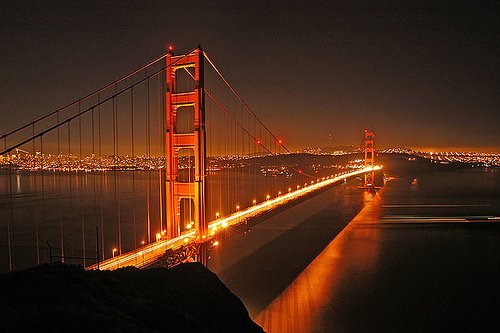
- Medium shot - this is used to show when characters are interacting.

- Close up - this is used to emphasize importance to the audience.

- Shot reverse shot - this is used for dialogue. you focus on the speaker with the camera positioned on the other persons shoulder. This makes the audience feel like they're part of the conversation.
- High angle - this is when the camera is up high pointing down. This connotates that you have power over the object or person you're viewing. Traditionally women are filmed like this to make men seem more powerful.

- Low angle - this is the opposite to the high angle it's used to make an object or person seem more powerful. Men are usually show in this angle.

- Tracking shot - this is when the camera is parallel to the action and follows it on a track.
- Tilt - the camera goes up and down, normally done from women's feet to the woman's face.
- Pan - this is when the camera swivels over 180 degrees.
Saturday, 26 September 2009
Mise en Scene
Mise en Scene is a french term for the analysis of everything you see on screen, this doesn't include sound. The 5 categories of Mise en Scene are:
- Lighting - why is the scene lighted the way it is? what does it symbolise? what does it tell you about the situation? what does it connotate/denotate?
- Setting - what does the setting say about the situation/character/action?
- Characters, acting and facial expressions - what do these show about the situations? what does it tell you about the charaters personality/feelings?
- Props and costume - what does this tell you about what's happening?
- Camera Angles - how do they make the audience feel? what does is show about the characters?
Narrative Theory - Vladimir Propp
Vladimir Propp was a Russian critic and literary theorist who analysed over 100 Russian folk takes in the 1920's. He proposed that it was possible to classify different characters into clearly defined roles and the functions they do.
Propp's character roles:
- The Hero (who always aims to seek something)
- The Villain (who opposes the hero and tries to stop him)
- The Donor (who gives something to help the hero along his way)
- The Dispatcher (who sends the hero on his journey to seek in the first place)
- The False Hero (who pretends to be the hero)
- The Helper (who provides support to the hero)
- The Princess (the reward for the hero, normally a woman who needs protection)
- The Princess' Father (who gives the princess as a reward)
Today, not as many films, programmes or stories fit this, an example is pulp fiction where-as star wars fits this perfectly.
Narrative Structure
To every narrative there is a 3 part structure:
- Equalibrium (beginning) - a state of "normality" in the narrative
- Disequalibrium (middle) - something disrupts the "normality" and the protagonist must return the "normality"
- New Equalibrium (end) - a new "normality" is created.
Narrative Theory - Roland Barthes.
According to Roland Barthes, there are two types of narrative:
- Open narrative is like a soap opera in which the narrative (story) is on-going. This means that there could be multiple story lines going at once, one problem may be solved but another one will start so there will be an unlimited amount of episodes.
- Closed narrative is like a single programme. This normally means that at the end of the programme all problems will be resolved.
Although sometimes both of these can be present at once. For example in series and serials. In both of these there is a closed narrative within a long-running open narrative.
- Series is normally running over a long period of time. Soaps are a good example of a series for they run for years.
- Serials are normally over a short period of time. Normally a few weeks or months. Most programmes shown on tv today are serials.
The 5 Codes.
Throughout any media element, the 5 codes are present. These are:
- The Action Code - this applies to any action that suggests further action is necessary. For example, if someone produces a ring to propose, we wonder what the action of the other person will be and what the outcome will be.
- The Enigma Code - this is anything in a story that hasn't got an explination which raises questions to the audience which makes them demand an answer. This normally runs throughout.
- The Semantic Code - anything in a text that connotates to the audience.
- The Cultural Code - this is anything that points towards our shared knowledge about the way our world works and things in our culture that we see as normal.
- The Symbolic Code - this is only explainable if you understand binary opposites.
Binary Opposites
Levi Straus believed that to every one thing there must be something making it so. For example, for something to be black, there must be a white and for something to be good there must be something bad to oppose it.
Ideology
This is an organised collection of ideas. It can be a belief that helps explain the world around us. For example, people have different ideologies about what happens after we die. e.g. we are re-incarnated; we go to heaven etc.
Subscribe to:
Posts (Atom)


